Web design is the process of creating the individual web pages that make up a website in order to reflect the information and brand of a business and to guarantee a user-friendly experience.
One of the foundations of having an online presence in the modern day is building a website.
The world of web design is therefore as active as ever and in order to suit the expanding needs of website owners and visitors alike, web design is continually improving, including user interface design.
It is frequently a collaborative process that integrates expertise and resources from related fields, including UX, SEO, and web design statistics.
When creating a website or updating content on a web page, appearance and design are essential components.
In this article, we examine web design and the common design elements that web designers work with.
Principles of design – applicable to web design
Knowing what good web design is and how to achieve it is one of the first steps in designing websites.
The principles of design, a theory used by artists and designers to describe the aesthetic qualities every composition should strive for, can be used as a guide to achieving good web design.
Both novice and experienced web designers can create websites with a unified look and feel by using these principles in web design.
Naturally, these are guidelines to help you learn how to use the various design elements of a website and are not strict rules to adhere to.
A site composition is the section of a webpage where each element of your design comes together to produce the whole i.e. when your text, photos, graphics, and colors all work together to create a single, cohesive design.
Let’s examine the following principles…
1. Visual hierarchy
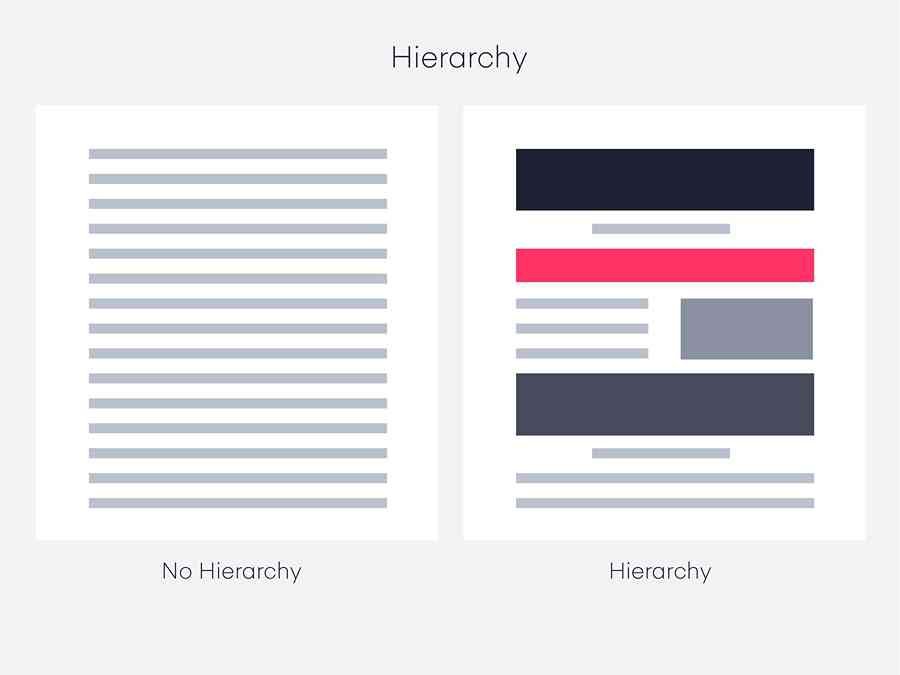
This is the sequence in which a user will read the data on a web page from your website.
By incorporating a visual pattern throughout the website, the designer can direct users’ eyes and behaviors, leading them from one element to the next.
This is accomplished by managing the composition of a web page’s parts, including their size, orientation, and order.
For instance, F-patterns or Z-patterns draw attention to the top horizontal area of a site, which is typically where designers place the navigation, the brand’s logo, and occasionally a search box as these elements spark user engagement.
Due to this, the principle of hierarchy tells us that the most crucial information should be shown in a prominent area so that users can easily see it and engage with it.
2. White space
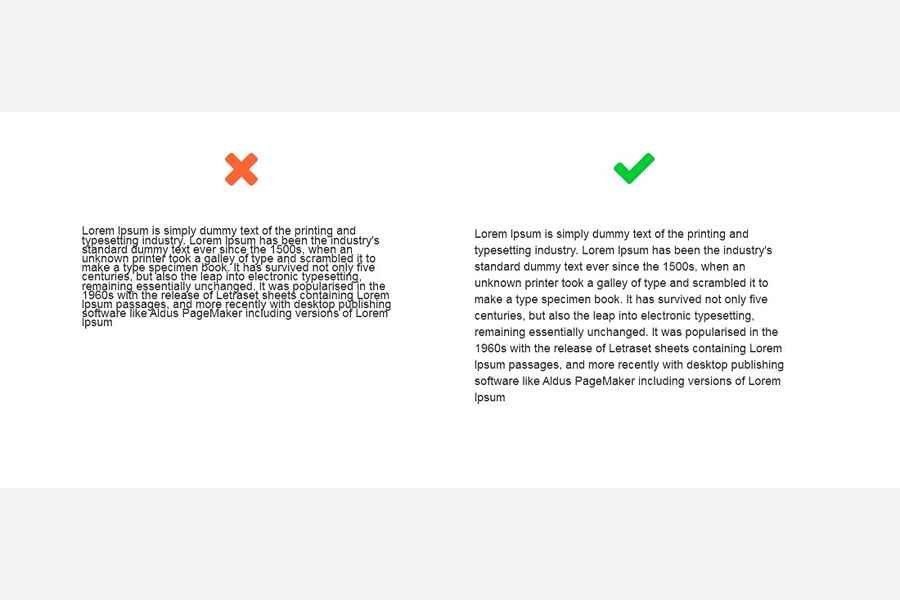
White space, often known as negative space, is any portion of the composition of a web page that is devoid of visual elements.
For websites to be aesthetically beautiful and simple to navigate, spacing is a crucial component.
The intentional placement of white space in web design will allow the visual elements of a webpage space to breathe and prevent a busy or congested look that is difficult to read.
Additionally, it can aid in achieving other objectives in your composition, like hierarchy, balance, focus, and more.
Every component of your design—graphics, margins, gutters, columns, text, or visuals—will use spacing in some way.
A design that precisely balances text, pictures, and graphics, increases legibility, and inspires action requires the effective use of whitespace.
3. Unity
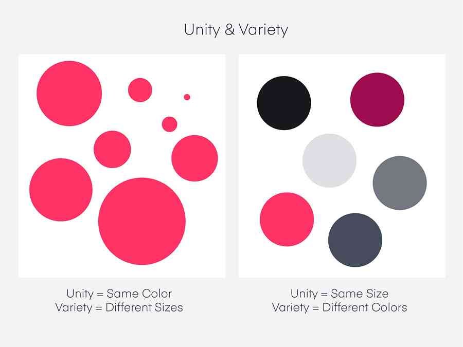
All of the separate components you’ve put to your website should work together harmoniously to create unity as their overall result.
The aim of web design unity is to prevent users from becoming overwhelmed, perplexed, or leaving your site.
It could take a few tries to get it perfect, but once you do, you can ensure that every element of your site contributes to its performance and functionality.
This entails being mindful of the elements you use, where and how you place them, and whether or not they actually serve a function.
4. Balance
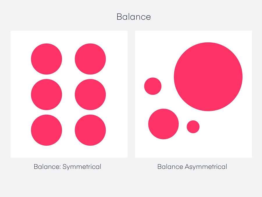
A composition must have a visual balance such that no one piece dominates the whole.
This can be applied to web design by drawing an imaginary line down the middle of a webpage and placing elements so that the visual weight is equal on both sides.
On a website, there are primarily two methods for achieving balance:
- Symmetrical balance occurs when the perceived weight on both sides of a line is equal and arranged in a mirror image. When used in web design, this can elicit emotions of harmony, grace, and coherence.
- Asymmetrical balance is when there is equal visual weight on both sides but different compositions and arrangements of the elements (i.e., not a mirror image). A balanced asymmetrical design is regarded as a modern strategy that will give the user a more dynamic experience while preserving a pleasing composition.
5. Contrast
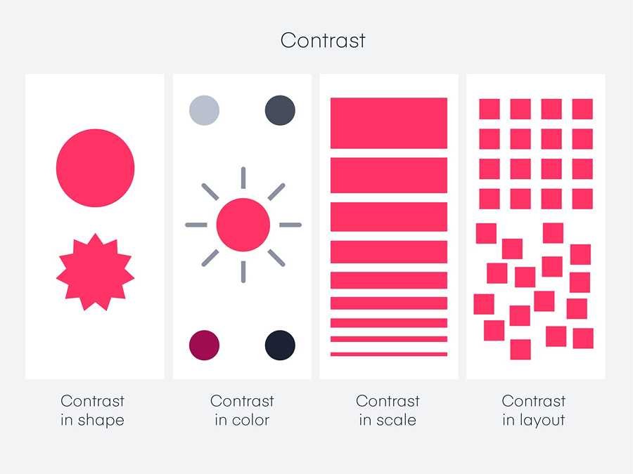
Contrast is the arrangement of opposing components, such as dark and bright, smooth and rough, and huge and small, in a way that emphasizes their differences.
When contrast is present, it attracts site visitors as they scroll through the pages of your website since it makes the page and its content easier to see and read.
The website’s text needs to be readable because users often spend only a short time on it as they need to access the information quickly.
A web designer can accomplish this by choosing a suitable pixel and size for the text.
Readability is improved by having text that contrasts well with the background color of the website.
6. Emphasis
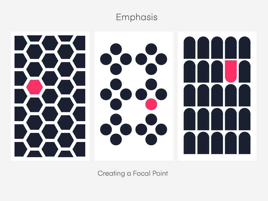
The concentrates on the principle that not all website components are of equal importance to the users.
Applying the principle of emphasis on a webpage includes the use of a bright color, animation, or size to ensure that the element that you want people to notice first is the dominating one on your composition, whether it be the logo, an image, or a call to action.
7. Repetition
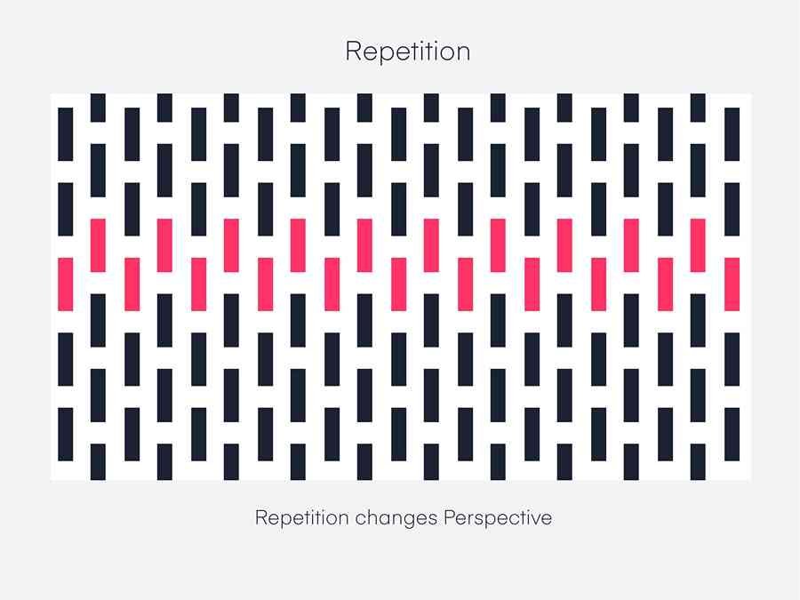
This refers to the repeating of website elements to establish coherence and consistency toward emphasizing a particular brand theme.
Repeating elements like your site logo, brand colors, and the font you use on your site will help to establish your brand’s identity and online presence.
Visual elements of web design
Every website design consists of a wide range of elements, including groups of visual and functional elements.
The visual elements of a website combine to create its overall feel and look.
These elements —from color schemes to fonts to media elements—have an impact on user experience and help to define your brand.
We’ll discuss the visual elements of web design below…
1. Site header

When a visitor first arrives at a website, they see the very top of the page, which is referred to as the website header.
A header is typically used in such an important spot to show the navigation menu, company name, logo, or contact details.
It is created in a way that entices website visitors to take action.
2. Site Layout
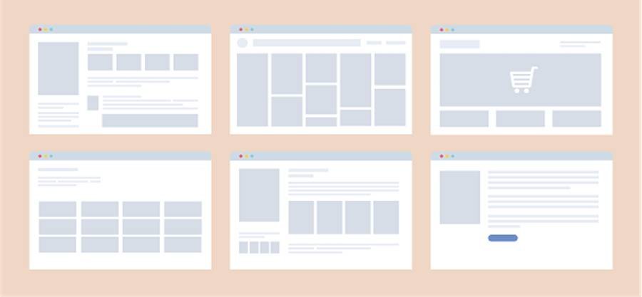
The layout determines the arrangement and sequence of the visual elements on each page of your site; it is similar to the foundation upon which the design composition is displayed on a web page.
The layout is a crucial task because the way you organize your site content will significantly affect its usability and functionality.
Your website’s objectives, the message you want to send visitors, and the type of content you will use can all influence the best layout for your website.
There are no strict guidelines to follow when choosing a layout, but it should be simple, intuitive, and accessible taking your target audience into account.
The components of the site can be arranged and kept in the proper order using white spaces, which are empty spaces.
You can design specialized layouts for desktop screens and mobile devices, as mobile-friendly websites are essential because many visitors access websites via cell phones or tablets.
You can use a responsive template that adjusts to various screen sizes or a mobile-only template designed for mobile displays that will activate when a non-desktop device connects to the website.
3. Color scheme
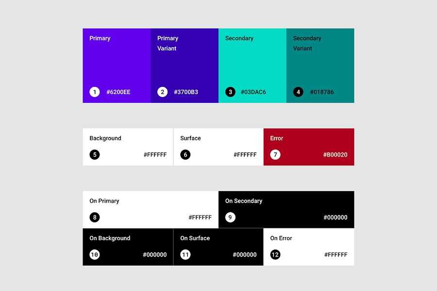
Your website’s colors determine the mood of the site!
Strategically using branded color schemes across your website can help to strengthen your online branding because they go well with the overall look and feel of your website.
A color scheme is a grouping of color hues that works well with the brand and the industry it represents.
You get a color scheme by choosing the color that will represent the primary color which will be the dominant color on the site, the secondary color which is used less frequently than the primary, and the accent color which is used to highlight certain important details of your site like a call to action section.
Take into account the colors that visitors to your website are more likely to find appealing and then match them with your brand and the ideas you want to get across to your audience.
4. Typography
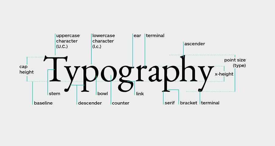
Typography describes the visual elements of text, such as font selection and text arrangement.
It is an essential component of web design that can be used to enhance the written content on a website or to support the aesthetic style of the site.
It should complement your website’s overall tone and go well with your graphics, images, and color scheme.
A good web design uses a single attractive and easy-to-read font or a combination of fonts.
You should select a font that is appropriate for the intended audience, which are fonts that are readable, fit your website’s stylistic theme, and are most importantly consistent with your brand.
5. Content
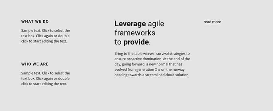
The entirety of the website’s information is referred to as the content.
Since this is what your website visitors came to get, it is a crucial component.
The likelihood that readers will become customers increases when a website communicates effectively and captures their attention.
Fundamentally, the look and feel of your website depend on the text; as a result, it is critical that your content and designs coordinate to produce a cohesive design with balanced elements.
Concentrate on writing in sections that will complement your graphics and images and use a tone that will appeal to readers in your field or industry.
6. Images
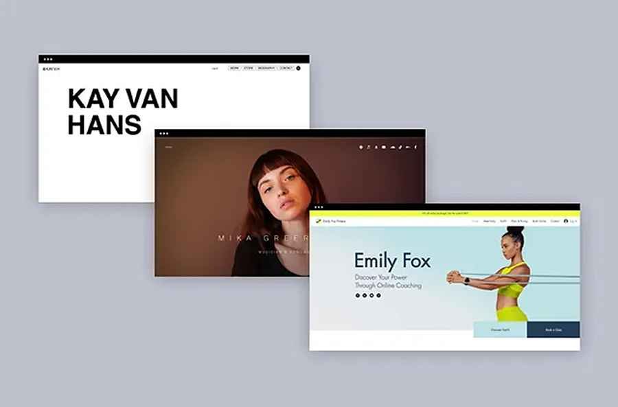
Illustrations, graphics, photos, icons, and other types of images are used to supplement the text on a web page.
Amazing designs can strengthen your message to visitors in a matter of seconds and convey a great deal of information.
You can choose images that go well together with the brand the website represents to achieve the desired effect.
This could entail showcasing the goods or location of your company, adding images from an event, including a branded favicon, and so on to give your site’s design a little extra flair.
Additionally, you can access and use thousands of relevant royalty-free stock images from the internet on your website.
7. Videos
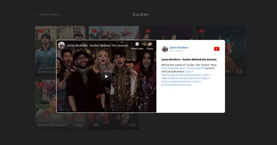
The use of videos in web design is a trend that is gaining popularity in the modern era.
When used properly, videos can assist users in experiencing or comprehending a message that cannot be adequately communicated through text or images; however, be careful that they do not compete with or draw attention away from other crucial elements on your site.
8. Site footer

Every page of your website has a footer, which is fixed at the bottom of the page.
Since it is the last thing visitors will see, hence you can add and reiterate crucial information here.
A map, an email sign-up form, contact information, and social media buttons are frequently placed here as well.
9. Compliance

Depending on the target audience, your website needs to comply with local and international laws because if it doesn’t, it could face penalties.
Site policy pages must be present on your website as per legal requirements.
This can range from your privacy policy, which explains how you handle user data on your site, to your terms and conditions, which describe how to use your site, its trademarks, and its contents.
You must also include an affiliate disclosure if you are earning money from affiliate links on your site.
You must disclose to your users that any images, text, or videos on your site are sponsored if you receive payment for them.
You also have to ensure your site abides by pertinent data protection laws like GDPR, HIPAA, CCPA, etc.
Functional elements of web design
Website functionality, in essence, refers to how your website functions, including its speed and usability as well as the specific actions that can be carried out on it.
When designing your website, it is essential to take these functional components into account as a properly functioning website is essential for both high search engine rankings and the best user experience.
Let us go over the web design elements that will impact how your site works.
1. Navigation
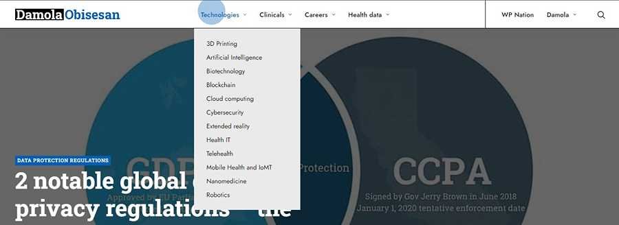
One of the key factors in determining whether your website is functioning efficiently is its navigation, as it allows users to move between pages and sections of your site by linking to multiple items on your website.
Depending on the layout and structure of the website, your navigation menu might appear in the header, body, or footer of your site.
Your navigation can have a variety of functions, including facilitating the discovery of your site’s features by new visitors, facilitating easy access to your pages for recurring visitors, and enhancing the user experience for all visitors.
You can select from a variety of navigation layouts and designs, such as a hamburger menu that conceals and reveals navigation items, one-click buttons that take users back to the top of a web page, and so on.
2. Accessibility
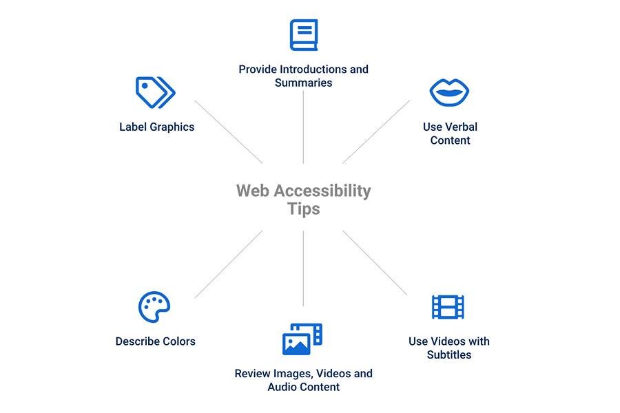
Testing for accessibility is required to make sure that the website is inclusive and meets the needs of users who may have special needs.
Regardless of any disabilities or impairments users may have, the site should be simple for them to use.
Each user must be able to navigate without any significant problems and it must work well with screen readers.
3. Mobile responsiveness

Since mobile devices now account for more than half of all online traffic, it is crucial that your websites be optimized for them.
There are two design styles that allow a web design to be converted from its desktop version to its mobile version: adaptive design and responsive design.
Responsive design involves creating websites in a single version with a flexible grid that creates a dynamic appearance, depending on the screen size and orientation of the device used to view it, as opposed to adaptive design, which entails creating different versions of the same website, each of which is designed for a particular size screen or browser width.
Whichever is chosen, they both look fantastic on various screen sizes.
4. User Interactions

Depending on their devices, your site visitors can interact with it in a variety of ways, such as by scrolling up and down the page, clicking a link or button, typing text, filling out a form, etc.
The best website designs make these interactions simple so that the user feels in charge.
This is accomplished by avoiding the auto-play feature on your website and any other features that are uncontrollable and sticking to the screen.
Among the best practices are never using autoplay for audio or video, underlining text only when it can be clicked, making sure all forms are mobile-friendly, avoiding pop-up notifications, etc.
5. Speed
Site speed or loading speed refers to how quickly a visitor can access your website content after entering it.
Nobody likes a slow website.
When a page takes longer than a few seconds to load, a visitor may quickly decide not to stay on the site or come back.
No matter how attractive your web design is, you can not compete unless you give users the best browsing experience, and if your site takes a long time to load, search engines will preclude it from top search results.
Many things can influence how quickly a page loads; some have to do with the visitor’s own computer or internet connection, while others might be unique to the website they are trying to access.
6. SEO
A key factor in the success of your website is SEO, or search engine optimization, which is the process of optimizing a website so that it ranks well on search engines.
The more people who can find you on Google, the more users your website will receive.
Even though SEO is a continuous process, there are steps you can take to improve the performance of your site right away.
These include using headings in your content, adding alt text to images, and using meta descriptions on relevant pages.
7. Cross Browser Compatibility
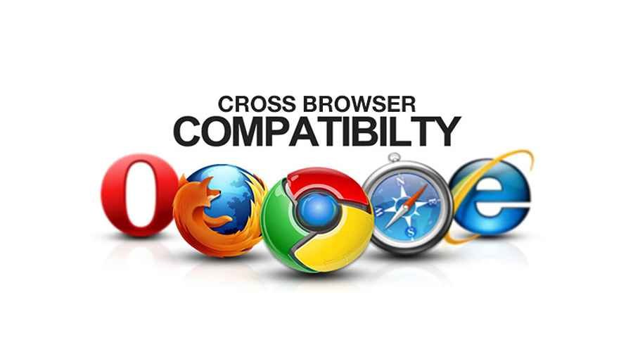
This refers to the elements of our website appearing as intended in any widely used web browser that can be used on any device.
The best web design makes sure that every design element that is incorporated into a site must display and perform flawlessly on every device and browser that is used to view the site.
This level of consistency can only be attained by repeatedly testing on actual browsers and devices.
Did you enjoy this post?
If so, please share it with your friends and followers on social media! It's a great way to help others learn about WordPress and to support our blog. You can use the share buttons below...
Elevate Your Brand with Professional Website Design
Discover how we can transform your online presence with professional website design services. We specialise in creating modern, user-friendly websites tailored for the medical, legal, university, and Christian sectors. If you're ready to elevate your brand and connect with your audience more effectively, contact us today to get started!
Tutorials on YouTube
And if you’re looking for more in-depth WordPress tutorials,be sure to subscribe to our YouTube channel! We have a wide variety of videos on WordPress.
